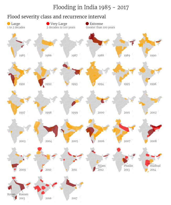
Inspired by this post showing the major flooding events in the US, I created a similar graphic for India. You can find an interactive version here – hovering over each flooding, shows some more information about the event.
- The graphic uses flooding related data from the Dartmouth Flood Observatory
- The data for 2017 events is not up-to date.
- It is very likely that there is some missing data, and some inaccuracies in the data. 1987, for instance, doesn’t show the Bihar flood.
- The flood severity is indicated by the color of each shape
- Each shape represents the geographic flood extents - based on information obtained from news sources.
- The data for India map shape is obtained from this topojson collection
It is interesting to look at the severity definitions here – the extreme class floods, for instance, are defined to be those that have an estimated recurrence interval of over 100 years. In a span of 30 odd years, there are a whole bunch of regions which have been affected by extreme floods. Yet another case in point showing that the climate change shit has really hit the roof!
Code
I used ogr2ogr to convert the shape file obtained from the Dartmouth Flood
Observatory
ogr2ogr -f geoJSON data/floods.json FloodArchive_region.shp
This file turned out to be about 6MB. I created a file with only Indian floods by parsing the json file.
import json

with open('floods.json', encoding='latin-1') as f:
    data = json.load(f)

india_features = [
    feature for feature in data['features']
    if feature['properties']['COUNTRY'] == 'India'
]
data['features'] = india_features

# FIX some names in the data
NAME_FIXES = [
    ('Tropical Storm K', 'Tropical Storm Komen'),
    ('Tropical Storm Hudhug', 'Tropical Storm Hudhud'),
]
for feature in india_features:
    for name, fix in NAME_FIXES:
        cause = feature['properties']['MAINCAUSE']
        if name in cause:
            feature['properties']['MAINCAUSE'] = cause.replace(name, fix)

with open('india-floods.json', 'w', encoding='latin-1') as f:
    json.dump(data, f)
The visualization code itself is about a hundred odd lines of d3 code.