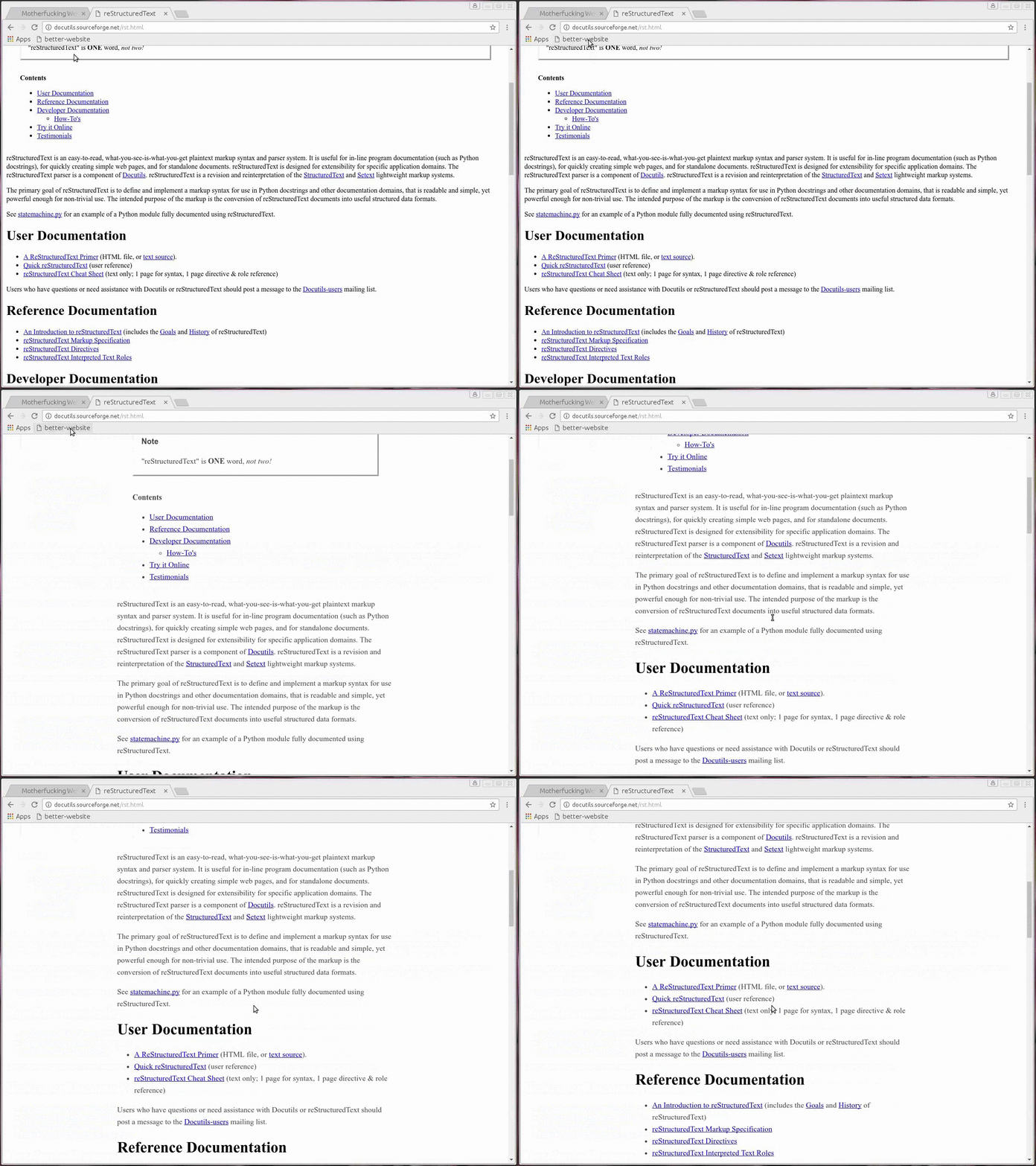
Better styling bookmarklet
Some sites that I like a lot for their content, have zero styling on them. I find it pretty hard to read when the lines are long and I have to read all the way on my screen.
I had a simple bookmarklet until now that just changed the width of the page.
document.getElementsByTagName('body')[0].setAttribute('style', 'width: 600px')
Kamal shared with me a recommendation for 7 simple styling rules that will make pages easier to read. I liked them, and modified my bookmarklet to use these rules now.

Drag and drop the link below onto your bookmarks bar if you want to use it.
The code in a readable format is below.
// Create new stylesheet

(function() {
    // Create the <style> tag
    var style = document.createElement("style");

    // Add the <style> element to the page
    document.head.appendChild(style);

    // Add rules from bettermotherfuckingwebsite.com
    var sheet = style.sheet;
    sheet.insertRule("body{ margin:40px auto; max-width:650px; line-height:1.6; font-size:18px; color:#444; padding:0 10px; }");
    sheet.insertRule("h1,h2,h3{ line-height:1.2 }");

})();
Update : baali pointed me to Firefox’s Reader View which works well too.